Published
- 5 min read
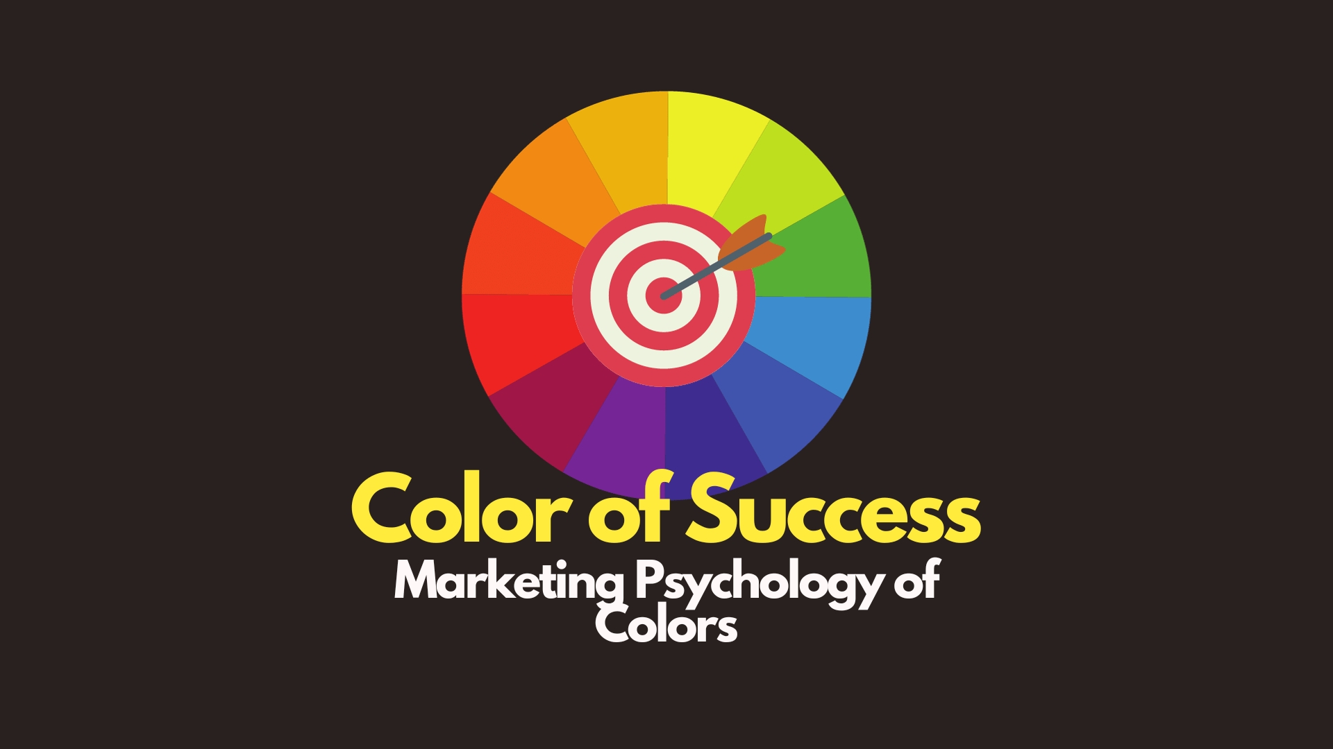
The Color of Success: Understanding Marketing Psychology Colors
The Color of Success: Understanding Marketing Psychology Colors
Introduction
Ever find yourself irresistibly drawn to a brand because of its colors? Whether it’s the calming blues of a tech company or the vibrant reds of a fast-food chain, colors play a pivotal role in shaping our perceptions and driving our decisions. This article will decode the fascinating science of color in marketing psychology. Get ready to see the world in a whole new spectrum of colors!
Decoding the Psychology of Colors
Why Colors Matter
Colors are more than just visual elements; they evoke emotions, stimulate the senses, and even influence subconscious decisions. Understanding the psychology behind colors can offer marketers a potent tool for capturing attention and driving action.
The Neuroscience Angle
Recent advances in neuroscience have shown that color perception is not just a passive process; it activates specific brain regions responsible for emotions and decision-making. So, when you choose a color, you’re essentially speaking to the consumer’s brain.
The Color Wheel in Marketing: A Comprehensive Guide
Understanding the Basics: The Color Wheel Explained
Primary Colors: The Building Blocks
Red, Blue, and Yellow are the primary colors, serving as the foundation of the color wheel. They are pure colors that cannot be created by mixing other colors.
Secondary Colors: The Next Step
Mix two primary colors, and you get a secondary color. The secondary colors are Green, Orange, and Purple. For example, red mixed with yellow gives you orange.
Tertiary Colors: The Intricacies of Mixing
Tertiary colors are created by mixing a primary and a secondary color. Examples include red-orange, blue-green, and yellow-green.
Jargon Alert: Tertiary Colors might sound like a complex term, but it simply refers to the colors created by a more nuanced mixing of primary and secondary colors.
How to Choose Your Brand’s Color Palette: A Step-By-Step Guide
Understand Your Brand’s Identity
Before picking a color scheme, it’s crucial to understand what your brand stands for. Is it youthful and vibrant, or mature and sophisticated?
Know Your Target Audience
Different colors resonate with different demographics. Research your audience’s preferences before finalizing your palette.
Test and Iterate
A/B testing can be a useful method to determine how your audience reacts to different color schemes. Monitor metrics like Click-Through Rate (CTR) and Time on Page to measure effectiveness.
Pro Tip: Don’t just settle on a color palette; make sure to test its effectiveness through real-world applications and adapt as needed.
Real-Life Example: The Brilliance of Google’s Color Palette
Google’s logo employs primary colors but also uses a secondary color, green, for the letter “l.” This simple yet vibrant palette aligns with Google’s brand ethos of simplicity, efficiency, and inclusivity.
Table: Google’s Color Choices and Their Psychological Impact
| Color | Psychological Impact |
|---|---|
| Red | Urgency, Excitement |
| Blue | Trust, Reliability |
| Yellow | Optimism, Clarity |
| Green | Growth, Harmony |
Specific Colors and Their Psychological Impact: A Deep Dive
Red: The Color That Demands Attention
Why Red Captures the Eye
Red is not just a color; it’s a call to action. Known for its urgency and excitement, red often commands immediate attention.
Applications in Marketing
Red is prevalent in sales promotions and clearance events. You’ll often see phrases like ‘Buy Now’ or ‘Limited Time Offer’ in red to trigger immediate responses.
Fun Fact: Ever wonder why YouTube’s logo and play button are red? It’s because red stimulates excitement and engagement, aligning perfectly with the platform’s purpose of offering dynamic content.
Blue: The Color of Trust and Professionalism
The Calming Effect of Blue
Blue is synonymous with trust, reliability, and tranquility. It has a calming effect, making it ideal for sectors that require a high level of trust, such as banking and healthcare.
Examples in the Corporate World
Many banks, including Chase and Bank of America, use blue in their branding to evoke feelings of security and trustworthiness.
Table: Common Industries That Use Blue
| Industry | Reason for Using Blue |
|---|---|
| Banking | Trust |
| Healthcare | Calmness, Trust |
| Technology | Innovation |
Green: The Color of Renewal and Health
Why Brands Go Green
Green is the go-to color for brands focused on health, wellness, and sustainability. It evokes feelings of renewal and growth, and it’s often used to signify eco-friendly or organic products.
Real-Life Example: Whole Foods Market
Whole Foods, known for its commitment to natural and organic products, smartly employs a green logo. This aligns perfectly with its brand ethos and attracts a like-minded customer base.
Did You Know?: Many wellness apps also use green to signify health and positive growth.
How to Implement Color Psychology Across Marketing Channels: Mastering the Art
Digital Marketing: More Than Just Pixels and Code
The Impact of Web Design Choices
When it comes to digital marketing, color psychology plays a crucial role beyond just logos and branding. The color scheme of your website can directly influence user behavior, affecting critical metrics such as Conversion Rates, Time Spent on Page, and Click-Through Rates (CTR).
Strategic Use of Call-to-Action (CTA) Buttons
The color of your CTA buttons can make a significant impact. For instance, a red CTA button may incite urgency, while a green one might suggest a positive action or approval.
Pro Tip: A/B testing with different colors for your CTAs can provide valuable insights into what drives more clicks and conversions.
Real-Life Example: The Psychology Behind Facebook’s Blue Theme
Facebook’s dominant blue color isn’t just a random choice; it’s a strategic decision. Blue not only induces feelings of trust and security but also is one of the few colors that people with color blindness can easily distinguish.
Table: Color Choices and Their Impact on Digital Platforms
| Platform | Dominant Color | Psychological Impact |
|---|---|---|
| Blue | Trust, Security | |
| YouTube | Red | Excitement, Engagement |
| Spotify | Green | Creativity, Relaxation |
Traditional Marketing: Where Color Comes to Life
The Billboard Effect
Color psychology isn’t restricted to the digital world; it’s equally effective in traditional marketing channels like billboards and print media. A well-chosen color can grab attention even from a distance, making your billboard more impactful.
Print Media and Packaging
When it comes to print ads or product packaging, colors can be used to evoke specific emotions or actions. For example, using green in an ad for an eco-friendly product can significantly enhance its appeal.
Did You Know?: Coca-Cola’s red branding is so iconic that it’s recognized worldwide, even in cultures with different alphabets.
Conclusion: The Spectrum of Opportunities in Color Psychology
The psychology of color in marketing offers a rainbow of opportunities for brands willing to dive deep into its nuances. Whether you’re a novice just starting or a seasoned marketer, understanding the emotional and psychological impact of colors can elevate your marketing strategies to new heights.